Candlestick Chart Basics — How to Read One
A candlestick chart shows the open, high, low, and close for each period. Learn to read the four prices, confirm them, and know when they fail.
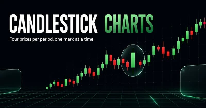
A candlestick chart is a price chart where each bar shows four numbers for a fixed time period: the open, the high, the low, and the close. The body spans open to close, the wicks reach to the high and low, and the color tells you which side won that period. That is the entire idea. Everything else is interpretation layered on top of those four prices.
Most beginners learn the shapes before they learn the prices, and that order causes problems later. A pattern name is just shorthand for what the open, high, low, and close did relative to each other. If you understand the four prices, you can read any candle without memorizing a dictionary of formations. This guide builds the reading skill in that order: the prices first, then the structure they form, then the conditions where the reading holds and the conditions where it quietly fails.
What a candlestick chart actually shows
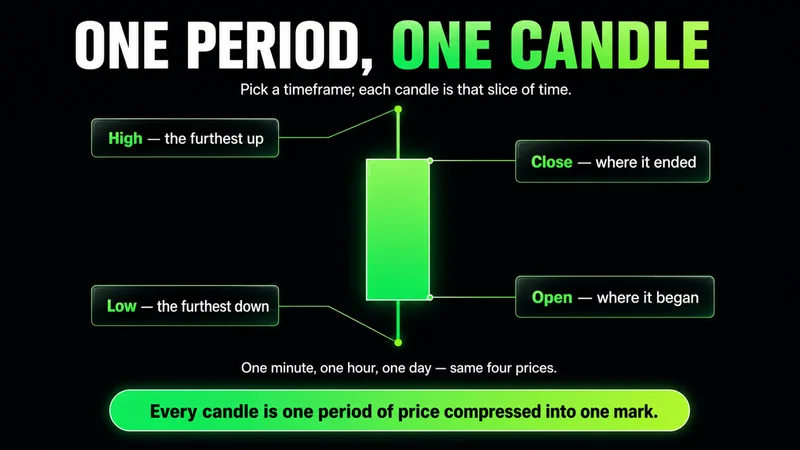
The candlestick chart meaning comes down to one period of price compressed into a single mark. Pick a timeframe — one minute, one hour, one day — and every candle on the chart represents that slice of time.
Each candle carries four data points:
- Open — the first traded price of the period.
- High — the highest price reached during the period.
- Low — the lowest price reached during the period.
- Close — the last traded price of the period.
The rectangular body runs between the open and the close. The thin lines above and below, called wicks or shadows, stretch to the high and the low. When the close is above the open, the body is usually drawn green or hollow, which means buyers finished the period in control. When the close is below the open, the body is red or filled, which means sellers finished in control.
Color only tells you the result of one period. It does not tell you who is in control of the broader move. A green candle inside a clear downtrend is still a green candle, and treating it as a reversal on its own is one of the fastest ways to get caught offside.
How to read a single candle correctly
Reading a candle is reading the relationship between its four prices, not reacting to its color. Start with the body, then the wicks, then the location.
The body size measures conviction. A long body means the distance from open to close was wide, so one side pushed price a long way and held it. A short body means open and close finished close together, which is indecision — price moved during the period but came back to roughly where it started.
The wicks measure rejection. A long upper wick means price traded much higher during the period and then sold back down before the close. Buyers tried, sellers answered. A long lower wick is the mirror: price traded down, then got bought back up before the close. The longer the wick, the more aggressive the rejection at that extreme.
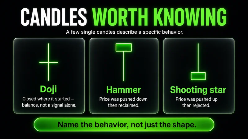
A few single candles are worth recognizing because they describe a specific behavior:
- Doji — open and close are nearly equal, leaving a tiny body. The period closed where it started. This is balance, not a signal by itself.
- Hammer — small body near the top with a long lower wick. Price was pushed down hard and bought back. In context, it shows demand stepping in at the low.
- Shooting star — small body near the bottom with a long upper wick. Price was pushed up and rejected. It shows supply stepping in at the high.
- Marubozu — a long body with almost no wicks. One side controlled the entire period from open to close with little pushback.
Notice that every one of these is just a description of where the four prices landed. You are not memorizing magic shapes. You are reading what happened.
Candlestick chart vs line chart — which one to learn on
The candlestick chart vs line chart question comes up early, and the honest answer is that they answer different questions. A line chart connects only the closing prices into a single line. It strips out the open, the high, and the low and shows you the cleanest possible version of trend direction.
That simplicity is the tradeoff. A line chart hides the rejection and the range that a candlestick preserves. A long lower wick that shows aggressive buying never appears on a line chart, because the line only marks where price closed. You lose the texture of the fight inside each period.
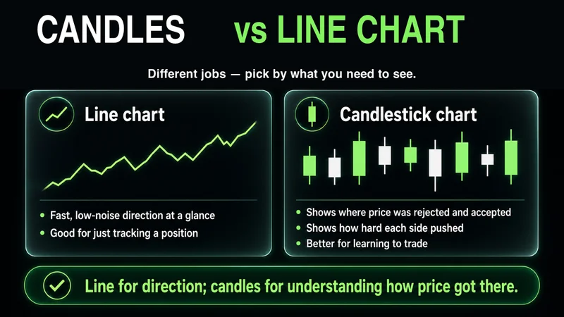
For reading direction at a glance, a line chart is faster and less noisy. For understanding how price got where it is — where it was rejected, where it accepted, how hard each side pushed — the candlestick chart carries far more information. If you are learning to trade rather than just track a position, learn on candlesticks. The extra detail is the point. A line chart is a summary; a candlestick chart is the record.
How candlestick patterns form across multiple candles
A candlestick chart pattern is just two or more candles read in sequence. The single-candle logic does not change — you are still reading open, high, low, and close — but now the relationship between consecutive candles tells the story.
The most commonly cited multi-candle patterns are engulfing and the star formations:
- Bullish engulfing — a down candle followed by an up candle whose body fully covers the prior body. Sellers controlled one period, then buyers took the next period and erased the prior move.
- Bearish engulfing — the reverse. An up candle followed by a down candle whose body swallows it. Buyers led, then sellers took over with force.
- Morning star — a down candle, a small indecision candle, then a strong up candle. The middle candle marks the pause; the third confirms the shift in control.
- Evening star — the bearish mirror at the top of a move.
These names are useful only as shorthand. What matters is the behavior they encode: one side losing control of price to the other across a short sequence. A candlestick chart reversal signal is meaningful when it appears at a level that already mattered — a prior swing high, a prior swing low, an area where price reacted before. The same engulfing candle in the middle of an empty range means almost nothing. Location is most of the signal.
How to confirm a candle before you act on it
Candlestick chart confirmation is the step beginners skip most often, and skipping it is expensive. A pattern is a hypothesis about who is in control. Confirmation is the evidence that the hypothesis is playing out before you commit risk.
Three things turn a candle from a guess into a reading worth acting on:
- Location. The candle has to form at a level that already matters — prior structure, a swing point, a clearly tested area. A reversal candle in no-man's-land is noise.
- The next candle. A bullish reversal candle should be followed by acceptance higher. If the next candle immediately erases it, the reversal failed. Waiting one period for follow-through filters out a large share of fakeouts.
- Volume. A pattern formed on heavy volume carries more weight than the same shape on thin volume. Participation is the difference between a move with backing and a move that fades.
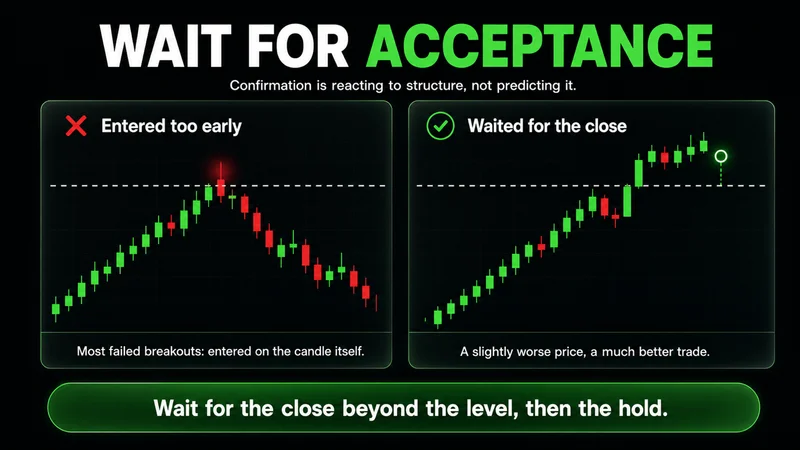
Confirmation is not hesitation. It is the difference between reacting to structure and predicting it. Most breakouts fail because traders enter on the candle itself instead of waiting for price to accept the move. The trader who waits for the close beyond the level, then the hold, takes a slightly worse entry price in exchange for a far better read on whether the move is real.
When candlestick reading stops working
Candlesticks are not equally reliable in every condition, and pretending otherwise is how confident readers lose money. The reading holds best in liquid markets during active hours, on a timeframe with enough participation to make each candle meaningful.
It breaks down in three places. On very low timeframes — one minute and below — individual candles are mostly noise, and a clean-looking pattern often reflects a single large order rather than genuine shift in control. In thin, illiquid conditions, such as overnight on low-volume instruments, the same shape that means something in cash hours means almost nothing, because a few contracts can paint any candle you like. And the first move right after major news is frequently the least reliable candle on the chart; volatility spikes produce dramatic wicks and bodies that reverse minutes later once the initial reaction clears.
Candlesticks describe what price did. They never promise what it will do next. The chart is a record of behavior, not a forecast.
The practical takeaway is to treat the timeframe and the liquidity as part of the signal. A hammer at a daily support level in a liquid market is information. The same hammer on a one-minute chart of a thin name at 3 a.m. is mostly random. Same shape, completely different weight.
Common candlestick chart mistakes beginners make
Most candlestick chart mistakes come from treating shapes as signals instead of reading the prices and the context behind them.
- Trading the candle in isolation. A pattern with no level behind it is not a setup. Location first, shape second.
- Ignoring the prior trend. A reversal pattern only reverses something. In a strong trend with no exhaustion, most counter-trend candles are continuation traps.
- Acting before the close. A candle is not finished until the period closes. Reacting to the shape mid-period means reacting to a candle that may not exist by the close.
- Memorizing names instead of behavior. If you cannot explain what the open, high, low, and close did, you are pattern-matching pictures, not reading price.
- Forcing reads in poor conditions. Thin liquidity and dead sessions produce candles that look clean and mean nothing.
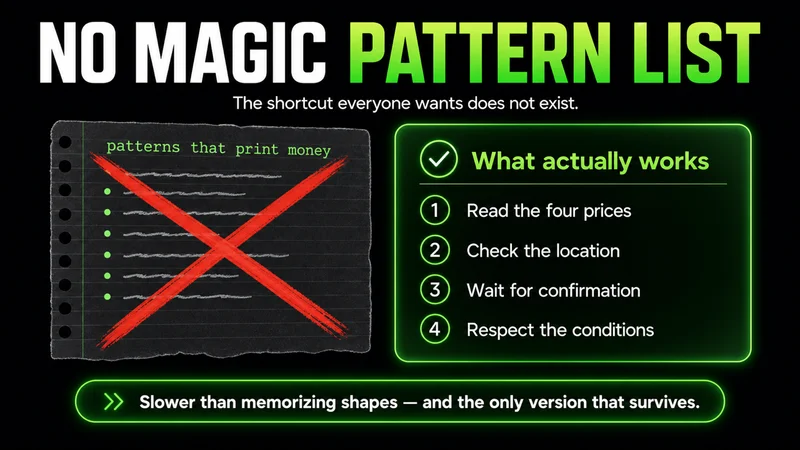
The shortcut everyone wants is a list of patterns that print money. It does not exist. What exists is the discipline of reading the four prices, checking the location, waiting for confirmation, and respecting the conditions. That is slower than memorizing shapes, and it is the only version that survives a live account.
A simple reading checklist for new traders
This candlestick chart checklist turns the whole process into a repeatable sequence. Run it on any candle before you give it weight:
- What did the four prices do? Read the body and the wicks before you name anything.
- Where is the candle? At a level that already mattered, or in empty space?
- What is the prior trend? Does this candle continue it or fight it, and is there exhaustion behind a reversal?
- Has it confirmed? Did the next period accept the move, and was there participation behind it?
- Do the conditions support the read? Liquid market, reasonable timeframe, not the first chaotic candle after news.
If a candle clears all five, it is worth acting on within a plan that defines your risk before entry. If it fails any of them, it is information, not a signal. The goal is not to react to every interesting shape. It is to act only when the price, the location, and the conditions agree.
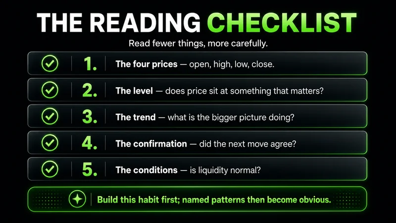
Reading a candlestick chart well is not about knowing more patterns. It is about reading fewer things more carefully: the four prices, the level, the trend, the confirmation, and the conditions. Build that habit first, and the named patterns become obvious instead of mysterious.
FAQs
What is a candlestick chart in trading? It is a price chart where each candle represents one time period and shows four prices: the open, the high, the low, and the close. The body spans open to close, the wicks reach the high and low, and the color shows whether buyers or sellers finished the period in control.
How do you read a candlestick chart for beginners? Read the four prices before the shape. The body size shows conviction, the wicks show rejection at the highs and lows, and the candle's location relative to prior levels shows whether it matters. Color is only the result of one period, not the direction of the larger move.
What is the difference between a candlestick chart and a line chart? A line chart connects only closing prices, so it shows trend direction cleanly but hides the open, high, and low. A candlestick chart preserves all four prices, so it shows the range and the rejection inside each period that a line chart leaves out.
How do you confirm a candlestick before entering a trade? Check that the candle formed at a level that already mattered, wait for the next period to accept the move rather than reverse it, and look for participation behind it. A pattern is a hypothesis; confirmation is the evidence that it is playing out before you commit risk.
What is the best timeframe for candlestick chart analysis? Higher timeframes such as the daily and four-hour produce more reliable candles because more participation goes into each one. Very low timeframes like the one-minute carry far more noise, where a single large order can shape a candle that looks meaningful but is not.
Why do candlestick patterns fail so often? They fail most when read in isolation, against a strong trend, in thin liquidity, or in the chaotic first candle after major news. A pattern describes what price did during one period; it never guarantees what price does next, so location and conditions decide how much weight it deserves.
Worth the read?